| Your browser does not display parts of our website correctly. We use the latest technology available to provide you with a high quality experience; please upgrade your browser to its latest version to view the contents properly: |
We have received many questions from our readers asking, "How does one go about learning chart reading?" This page addresses some of the significant basics.
What is a Chart? Simply put, a chart is plot of price fluctuations of an equity versus time. The chart is a "complete one" when volume is also plotted. Charts provide a record of the interplay of supply and demand for a given stock. They provide a history at-a-glance of trading in a stock, showing how many shares were traded, at what price they were traded, when they were traded, and so forth. It is very important to remember that the time period represented by a chart is one of the most critical things affecting what that chart can tell you.
What is Chart Reading? The purpose of "chart reading" or "chart analysis" is to gauge probable strength of demand versus pressure of supply for a stock, at various price levels. This allows one to predict the direction in which a stock may move and where it may stop.
The clues are provided by the history of a stock's price movements recorded on a chart. In the market, history often repeats itself. Chart price fluctuations tend, with some consistency, to fall into a number of patterns. Each pattern signifies a relationship between buying and selling pressures. Some patterns, or "formations", indicate that demand is greater than supply. Others suggest that supply is greater than demand. Still others imply that the two are likely to remain in balance for some time.
| Let's be clear about one thing before going any further. There is no infallible systems for predicting stock prices. There are educated guesses! |
A cursory glance at a few stock charts will reveal that prices have a tendency to move in a particular direction for a considerable time. A closer examination will show that this tendency, or trend, frequently assumes a definite pattern, zig-zagging along an imaginary straight line. In fact, this ability of prices to stay close to a straight line is one of the more extraordinary characteristics of chart movements. There is nothing mystical about chart reading. Stocks trace various patterns for reasons soundly based in human psychology. Remember, it is psychology that determines stock movements. The tendency for stocks to to move along a straight line, for example, is not hard to explain. In physical terms, it often is likened to the law of inertia (Newton's Third Law). That law states that an object in motion will continue in motion in the same direction, until it meets an opposing force. In human terms, an investor will tend to resist paying more for a stock than the price other people have recently been paying for it, unless it continues moving up, which will give him some confidence or hope that it will keep going up. Conversely, an investor will resist selling a stock for less than the price other people have been getting for theirs, unless the price keeps declining and he fears it will continue to decline.
|
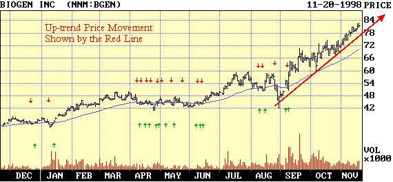
Figure 1: Stock prices often tend to move in straight lines, as is the case with BGEN shares above. |
|
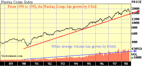
Figure 2: Market Indexes over a long period of time move in straight line trends |
Stock Trends Let us see how market psychology, reacting to a news development, forms a trend in an imaginary, but highly typical, case. Suppose XYZ Corporation is nearing completion of the development of a new product, or is about to launch its new Internet web site. Its stock has been selling at $40 a share. Insiders, executives, employees, relatives and friends are the first to learn about it. They are immediately removed from the ranks of those who might be willing to sell their stock at $40, $41 or even $42. Their shares are off the market. To that extent, the supply of stock at those prices has been reduced, creating a tendency for the stock to rise. More important, some of them will begin to buy more stock, increasing the demand. By that time, word of the new product may have reached brokers, investment counselors, chat rooms and other people in the industry concerned. The price has been rising steadily and attracting more and more attention. Traders and the general public begin to scramble aboard. Everybody loves to give, or get, a stock tip and more and more buyers are attracted. Then comes the public announcement of the new product, or the Web page. Brokerage firms, in pamphlets sent to their clients, discuss what effect the new product will have on XYZ's earnings. XYZ itself advertises and publicizes the product, or the Web page. All this creates new demand. An up trend has been established for the stock price. But there comes a point when the market price has fully "discounted", or "factored-in" the development. The stock has risen enough to take into account the increase in earnings likely to occur. This point is often reached by the time the public announcement is made. Many traders "sell on the news" to cash in their profits, especially when the news occurs after a sharp price rise.
A down trend may develop if it appears that the rise went too far. Perhaps the early estimates of sales and earnings were too optimistic. Perhaps other companies quickly introduce competitive products. Profits from other XYZ departments may decline. As the price of XYZ falls back, buyers who still have profits may cash in. Then, latecomers who bought near the top of the rise may sell out at a loss, to avoid even bigger losses. And so the decline continues.
So, for such well-founded reasons, stock prices do tend to move in a given direction for a considerable time.....up, down or sideways. Thus, an obvious first lesson to be drawn from chart reading is that, when a stock is found to be following a given trend line, it is quite likely to continue moving along that line. The ability to spot a trend gives the investor an edge in determining his market tactics.
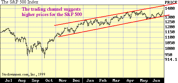
Trading Channels - Parallel trend lines, help outline trading channels. Briefly, channels are grooves, or ducts, through which prices move as they zigzag along a trend line. Once a trend line has been clearly established, a channel can usually be determined. Needless to say, channels seldom occur as neatly defined as in the selected charts shown in Figures 3 and 4. When the are found, however, they can be useful indicators of favorable levels for purchase or sale. It is perhaps obvious that the longer a stock has been moving along a given trend, or within a given channel, the stronger that trend is likely to be. For this reason, trend lines on longer range charts, such as weekly or monthly plots, are usually more reliable than trend lines that form on daily high-low-and-close charts. Even trend lines of one or two weeks duration are often not particularly strong indicators.
Figure 3: An upward trading channel is well established in this chart
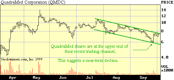
Figure 4: A downward trading channel is well established for QMDC.
| Changes in trading volume patterns often warn of a reversal in trend, before it actually happens. Here's an example. If an uptrend has been proceeding normally, with higher volume on rallies and lower volume on reactions, and suddenly volume subsides on the rallies and increases on the reactions, it is often a signal of a pending trend reversal. |
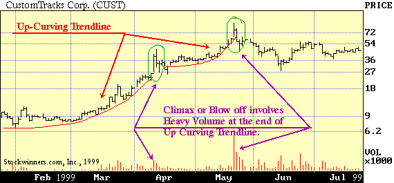
An interesting variation from the straight-line trend is the curved trend line. In some cases, the momentum of an advance or a decline suddenly picks up steam so rapidly that an established straight trend line curves in the direction of the move. Figures 5, 6, and 7 show up-curving and down-curving trend lines. If this curving occurs after an extended price move, it frequently results in a climactic action that brings the major movement to its final peak (or bottom, in a sell-off). Climactic action is synonymous with frenzied buying or selling. Price moves are exceptionally wide and volume is abnormally high. This type of trend line can be drawn with a "French Curve", and can be just as valid as the straight-line variety. However, it is very difficult to pinpoint the end of a climactic move until the reaction phase has begun. The "blow-off" or the vertically rising stage (or decline, in a sell off) can carry a considerable distance. Psychologically speaking, this is the time that investors blindly jump on bandwagon of a rising stock so they won't miss the recent rise or conversely, they sell because they are tired of seeing a stock lose its value. A disciplined market participant (at a blow off time) can find good values to either go short or long on a stock.
Figure 5: Upward blow off on ZIXI shares. (Formerly called CustomTracks Corp.)
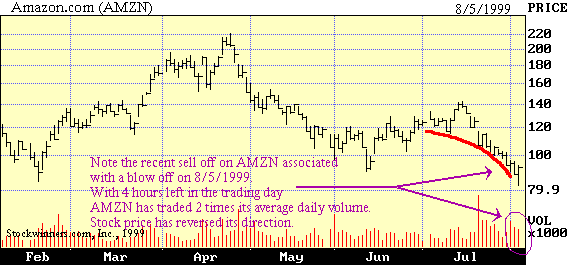
Figure 6: Downward blow off on Amazon.com (AMZN)
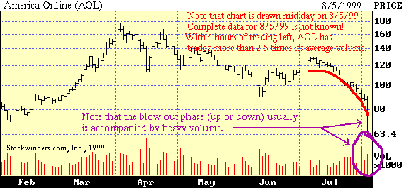
Figure 7: Downward blow off on America Online (AOL)
A support level is that price at which one may expect a considerable increase in the demand for a stock, or buying. A resistance level is that price at which one may expect a considerable increase in the supply, or selling. Such levels are not hard to find. Any price level where a great deal of stock has changed hands might be a support or resistance level.
Let's assume that you and many other investors bought the stock of XYZ Corporation in the range between $40 and $42 per share, and then saw it slip down to $35. The first reaction of the typical buyer is to hold on, in hope that the stock will climb above $42 and show a profit that will vindicate the buyer's judgment. However, if stock XYZ remains depressed, many buyers will begin to think it would be great just to break even. So if the stock finally heads back upward, the urge to sell will grow stronger as it gets closer and closer to the breakeven point. Naturally, the more trading that occurred in the $40-$42 price range, the greater the supply of stock for sale. Hence, the greater the resistance at that point to further advance. Now, suppose that after all those investors bought stock XYZ between $40 and $42, it went up instead of down. The analyst would peg the $40-$42 range as a support zone. He would expect that any subsequent slide would meet new buying demand as it returned to the $40-$42 range. There are a number of reasonable explanations. For one thing, those who sold out when the stock was at $40-$42 have been blaming themselves for selling all the time it was moving up. Many of them may be eager to buy back the stock at the price at which they sold it, and thus get "back on board" without embarrassment. They may then say that they were right all along about the great prospects of stock XYZ. Another group consists of those who thought of buying at $40-$42, but saw the stock "get away" from them. They may plan to buy any time it gets back to that price. A third type of major buying may develop from traders who sold short on the rise and purchase stock to cash in their profits when it falls back.
As the market develops, a support level may become a resistance level, and vice versa.
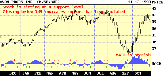
Figure 8: AVP price is about to drop below a key "support"
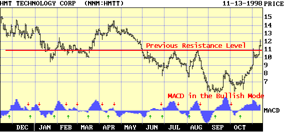
Figure 9: HMTT price broke through a key "resistance"
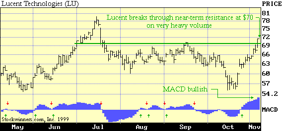
Figure 10: LU price broke through a "resistance" level
Double Tops and Double Bottoms are common chart patterns. The first one resembles the letter "M", while the latter resembles the letter "W". The market psychology of a Double Top can be explained in the following manner. The first peak represents the price level where a big enough supply of stock was put on the market to satisfy all demands and cause a moderate reaction. This reaction may reflect selling based on a combination of motives, such as a fairly widespread decision to cash in profits and a well-informed view that the stock has gone about as high as it's likely to go for the time being. After the reaction, "weak" holders of the stock may feel they missed an opportunity to sell out at the top. When "bargain hunters" and other optimists move in, running the price back to its previous peak, the sellers who missed the peak rush to unload. In addition, some of those who sold the first time have more stock to offer at the same price. The supply, therefore, again increases enough to drive the stock down. The Double Bottom can be explained in much the same way. The first bottom represents a point where bargain hunters come in to pick up the stock, because they think it has dropped as much as it is going to. A few points higher, these bargain hunters decide to take their profits. They are accompanied by those "weak hands" who did not sell at the bottom believe this is a good time to move on. Thus, there is a fresh new supply of stock for sale pushing the shares lower. The second bottom is formed by bargain hunters who just took profits. Other buyers come in to average down their costs. These are shareholders who have bought the stock at much higher prices and missed the first bottom opportunity to average down their share prices. Volumes are heaviest around the two peaks or valleys.
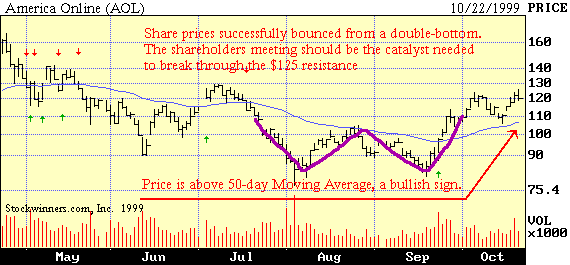
Figure 11: Note the heavy volume around each AOL bottom
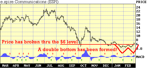
Figure 12: A double bottom usually involves breaking through a resistance point, as with ESPI above.
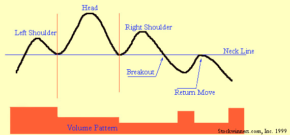
Head and Shoulders patterns are perhaps the easiest patterns to recognize, but there can be pitfalls that trap novice chart readers. A Head and Shoulders portrays three successive failed rallies and reactions. The second rally typically reaches a point higher than the other 2 rallies, thus forming the head. The failure of the third rally to equal the peak of the second rally is a warning that a major uptrend has come to an end. Figure 13 is provided to illustrate the rallies and the ensuing reactions. Please note the characteristic volume pattern.
Figure 13: Anatomy of a Head and Shoulders Pattern
The Left Shoulder is formed when an upturn of some duration reaches a climax in a rally. Volume is high on the rally and it diminishes on the reaction. The Left Shoulder is formed by people who bought stock before or during an uptrend, and are ready to sell and take their profits.
The Head is formed when a second rally carries the stock higher than the first one, but is followed by a reaction that erases all the gains. Trading volumes during the Head formation are not so great as during the Left Shoulder formation. Then Head is formed by persons who bought the stock after the Left Shoulder pullback, but are met with sellers who bought at the top of the Left Shoulder.
The Right Shoulder is formed when a third rally fails to reach the height of the Head, before the next selling reaction kicks in. Volume during the formation of a Right Shoulder must be less than the previous rallies, in order to confirm a Head and Shoulders formation. If the volume increases during the Right Shoulder, it could be a good sign that the stock is NOT forming the pattern and could breakaway to the upside. The Right Shoulder is formed by people who buy during a bargain hunting reaction to the Head formation. At the height of the Right Shoulder, several groups begin to sell, including those who bought at the Neck Line and the Head. These are investors who either want to breakeven or cut their losses.
A Return Move may be formed when people who bought at the top (Head and the two shoulders) attempt to average down. That is, they buy more shares at lower prices so their average price is lower than before. These same investors sell their shares at the neck line, along with others who sell in disgust and register their losses.
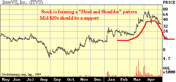
Figure 14: A Head and Shoulders Formation on Intervu, Inc. (ITVU)
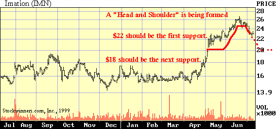
Figure 15: A Head and Shoulders Formation on Imation (IMN)
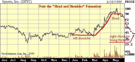
Figure 16: A Head and Shoulders Formation on Synetic, Inc. (SNTC)
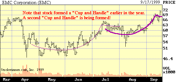
Figure 17: Cup and Handle formation on EMC share price. Note the volume pattern.
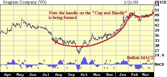
Figure 18: Cup and Handle Formations may take up to several months to complete. See VO above.
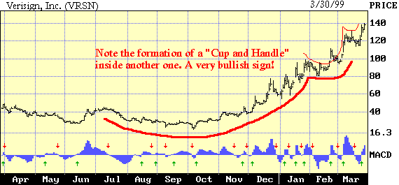
Figure 19: A smaller Cup and Handle may be formed inside a larger one, as with VRSN above.
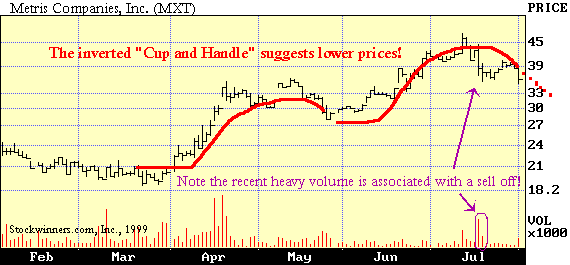
Figure 20: Inverted Cup and Handle Formations also form! MXT is an example.
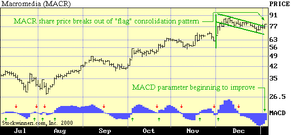
Figure 21: Flag Formation on Macromedia (MACR).
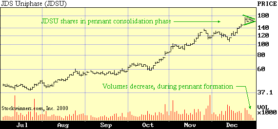
Figure 22: Pennant breakout on JDS Uniphase (JDSU)
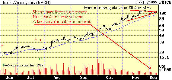
Figure 23: Pennant breakout on BroadVision, Inc. (BVSN)
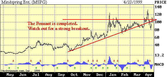
Figure 24: Pennant breakout on Mindspring Ent. (MSPG). Note that the MACD is also turning bullish.
|
The recommendations and information provided here should not be interpreted as investment advice, or as an endorsement of any security. Remarks and data are for informational purposes only and are provided without warranty of any kind. The trading of securities may not be suitable for all potential users of this information. You, not STOCKWINNERS.COM, INC. assume the entire cost and risk of any investing and/or trading you choose to undertake. Remember, past performance does not ensure future results. |